Role
As the UI/UX designer at Dynamoid, I worked closely with a small but mighty team of engineers, 3D artists, and researchers over the course of a year to design and build an interactive 3D microbiology learning platform. It was a full collaborative effort across the entire process, from concept, design, user testing, development, to running a large-scale study at the University of Washington.
Product Overview
The product we created was a real-time 3D microbiology simulation platform for college-level students and professors used primarily through web browsers on laptops. The platform allowed students to learn through interactive real-time 3D simulations. It also allowed professors to launch different simulations, and conduct real-time quizzes to test the students’ understanding.
Instructor Portal
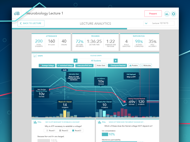
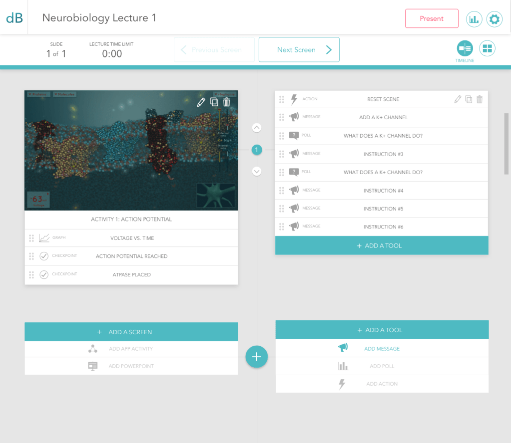
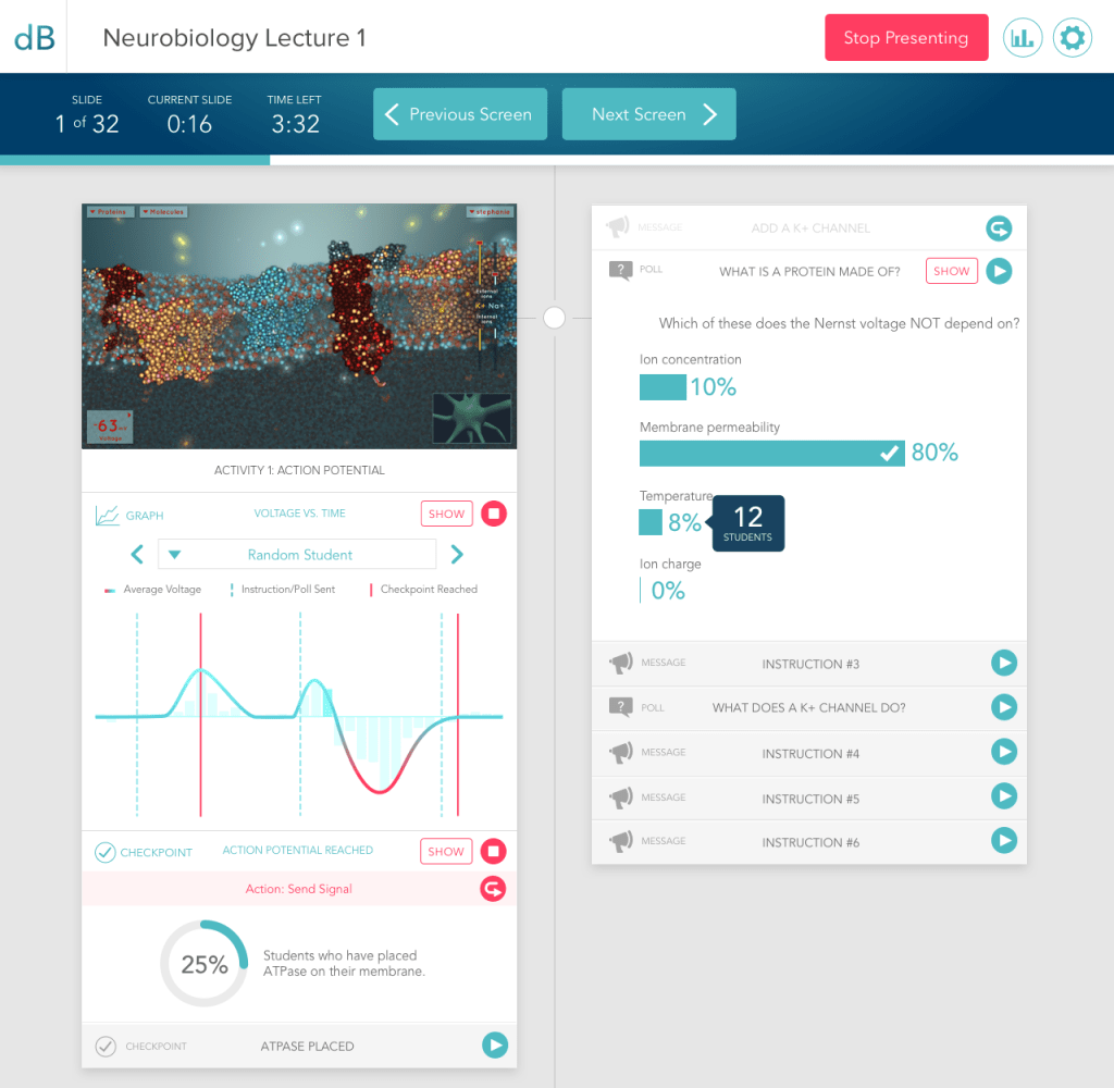
Through the instructor portal, professors can upload a Powerpoint presentation and add a simulation to it. The professor can start or stop a simulation during that presentation, launch an instruction within the simulation, launch a poll quiz to the students within the simulation, and analyze student progress in completing the simulation.
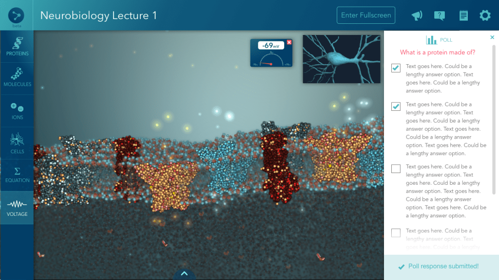
Student Portal
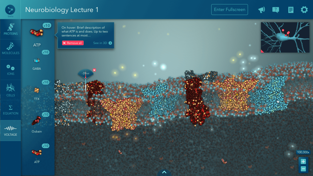
This is the student’s view of a launched simulation. They can interact with the simulation it within their browser, choosing molecules to drop into the simulation and observing the effect on the environment. The goal of this particular simulation is the make the neuron fire, which requires a certain pH balance to effect a voltage change. Students can also answer poll quizzes from within the simulation, and the professor will receive the responses.

Process
1. User Research/Need Finding
This is just the beginning. We ask potential users from our user types, as well as forward-thinking individuals in ed-tech, what features they would need in a product like this. We ask them which features are most important to them, so we can determine MVP features and scope.
2. Wireframing
I turn that initial MVP feature set into a basic visual form, mostly black and white boxes with Myriad text labels. We go over these wireframes as a team and iterate on them until the design agrees with engineering, usability, and overall product goals.
3. Image Prototypes
I make some quick and dirty image prototypes in Invision using the last round of wireframes to demonstrate flow, interactions, and transitions, just so everyone’s clear. Present to team, iterate until approved, then pass to engineers.
4. Implement basic prototype with HTML/CSS
The engineers need to start working on things, so these wireframe prototypes give them enough direction to start building basic framework for the site. I answer questions and help clarify interactions, as needed. “Things will change. It could be small things, it could be big things. But there will be changes,” I always tell them, as a disclaimer. Because things always change after the users see it.
5. First round of user interviews
At this point, we want to get feedback on features and concepts with the basic visual aid of wireframe prototypes. I make a test plan with our researcher and the founders, to cover the things we want to get feedback on. I take detailed notes on usability and verbal feedback as the researcher or another team member facilitates the interview.
6. Process feedback & iterate
Users know what they want better than we can read their minds, so I take my notes and document them as actionable features/fixes. We go over those features as a team and prioritize them based on need and development time. Some features need to get re-designed, some new features might get added, so I wireframe a bit more but start to develop a sense of the visual style for the product while wireframing.
7. Rough mocks
Wireframes evolve into rough mocks as I spend more time thinking about the design of the product. I apply a few basic colors to highlight buttons, things of importance, headers, and choose a more appropriate font than Myriad, creating more heirarchy in the layout and an initial visual identity for the product. This rough style guide of colors and fonts goes to the engineers when it’s final enough, to implement for another round of interviews.
8. Second Round of User interviews
With the core set of features being built into the product and placed where they “should” be, we want to see if users can get the hang of basic navigation with the help of some basic visual styles and colors too. I take notes on usability, we ask questions about their thoughts on the general look of things to gauge our direction, and ask for feedback on features of course. Some of the feedback is the same as the first interview, but there are always new insights as well.
9. Final mocks
As I’m iterating on features and continuing to develop the rough mocks, it naturally begins to evolve into a more fleshed out look and feel. Ugly strokes get smoothed out, corners get rounded, color palettes get tweaked until perfection, shades of gray are meticulously decided, font styles are determined.
10. Implement final mocks
Using Sketch and Zeplin, I’m able to cut down on time making style guides and spelling out pixel-by-pixel changes to the devs. Using JustInMind or Proto.io, I’m able to define transition animations and clarify flow complexities for the devs as well. I also use InVision to give feedback in comment form for the developers. These details are saved for last, until the developers are almost done building the functionality behind things.
11. Analytics
Don’t forget about the analytics! Being as I know exactly where users would need to click, drag, tap, or swipe to accomplish things, I help to determine where analytics code needs to be attached to the web app. We hook up the analytics so that when we do larger groups of user tests, we can track what users are doing and where they might be getting lost.
12. User testing
We do more individual tests with users as features are near final in implementation. These user tests are recorded so we can refer to specific interactions and verbal feedback from the user later. We draft detailed testing plans with clear questions, goals, a script, and a researcher facilitates the tests. I’m taking notes furiously on Google Docs while watching the test. These notes get synthesized into official reports for stakeholders by a researcher. At the same time, I synthesize the notes into potential action items for the team. We iterate to fix any interaction issues.
13. Large Scale Efficacy Study
This is a large scale study (400+ users) to prove the efficacy of our product to our stakeholders. Features are final and bug-proof at this point. I help with many rounds of QA testing beforehand to make sure all features are working as intended, black box testing to help uncover any unexpected bugs, and regression testing to check if fixes introduced any new bugs. This efficacy study is designed by the researcher and stakeholders, but I get to plan and conduct a focus group after the study to get anecdotal user feedback.
Conclusion
The efficacy study results showed that there was still a more work to be done in order for our technology to significantly improve learning, but we considered it to be a in the right direction of using synchronous technology to teach in the classroom.
