Background
The Google Cloud Online Experience team was tasked with improving a poorly built experience for its Google Cloud Partner Directory. Previous research and data on the directory experience made it clear that the directory was hard for users to use and understand, returned incorrect search results, and did not serve its purpose of aiding users to find an appropriate Google Partner to work with.
There was a lot of ground to cover in just 4 weeks before the next round of scheduled user tests, and the newly assembled project team needed rapid guidance and alignment on what improvements to make.
Spoiler alert: Google has a framework for vision and concept alignment (hint: Google Design Sprints), and I was ready to conduct an extremely condensed version of the design sprint, and execute on the designs based on those ideas.
Problem
The Google Cloud Partner Directory had been built as a custom tool without UX or development best practices in mind. This resulted in a search experience that was ineffective for customers:
- Users did not understand how to use the search functions and filters.
- The results returned were inaccurate.
- Users did not understand what services a GCP partner could provide for them through this tool.
Role
I was the Design Lead for this project team.
My responsibilities included:
- Facilitating alignment and ideation workshops
- Creating wireframes, mocks, and prototypes
- Gathering feedback from business stakeholders
- Planning user research
Team
The project team consisted of:
- Program manager
- 2 UX researchers
- Content strategist
- Lead developer
- Copywriter
Additional business stakeholders were involved as needed.
Workshop 1: User Needs
With the aggressive timeline of this project, we hit the ground running with a quick 2-hr workshop to understand and align the core project team on our goals for the project.
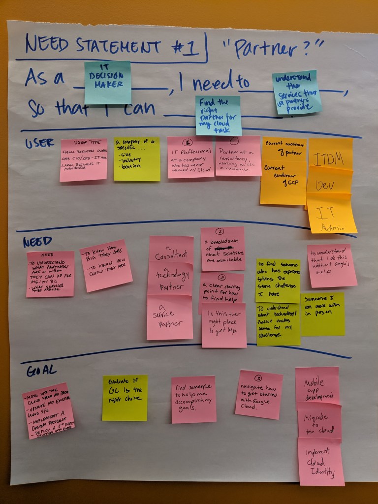
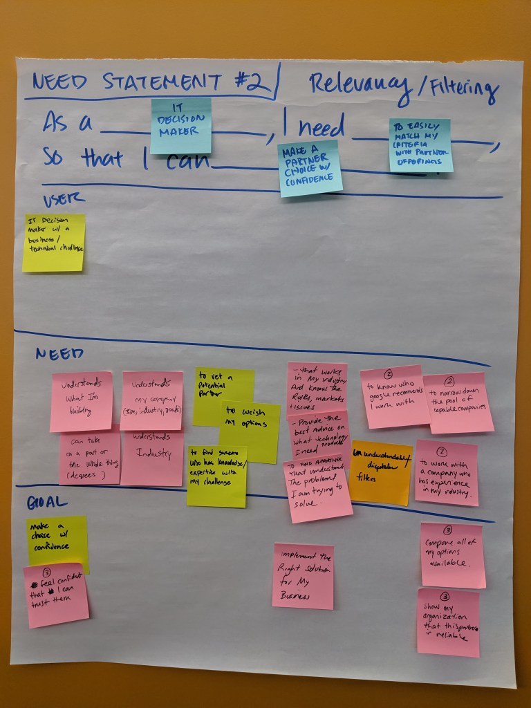
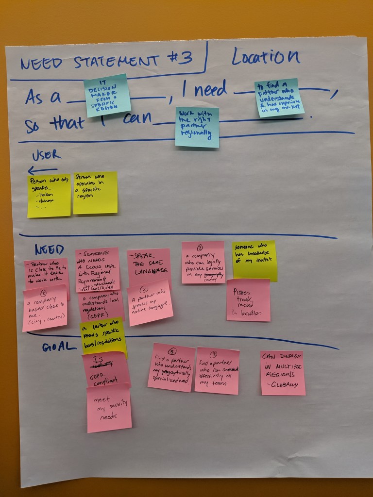
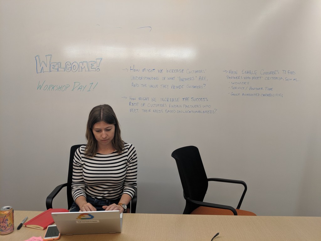
We came out of this workshop with 3 user needs statements, and a clear understanding of our target users, their needs and goals:
As an IT decision maker, I need to understand the services that Google Cloud Partners provide so that I can find the right partner for my cloud task.
As an IT decision maker, I need to easily match my criteria with partner offerings so that I can make a partner choice with confidence.
As an IT decision maker from a specific region, I need to find a partner who understands my market so that I can work with the right partner regionally.
We also arrived at a clearer definition of a Google Cloud Partner:
Trusted companies who help you get the most out of implementing or migrating to Google Cloud.
Workshop 2: Solutioning
Armed with user needs statements, we were now ready to open up the next workshop to additional stakeholders to contribute and align on solution ideas that would meet those user needs. I facilitated a 2.5hr, 10-person workshop (2 remote attendees).
During this workshop, we agreed on the definition of a “partner,” discussed pro’s and con’s of other competitor’s partner directories, individually sketched and presented solutions, and voted upon features that we agreed to move forward with.
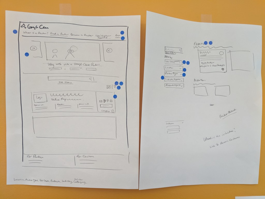
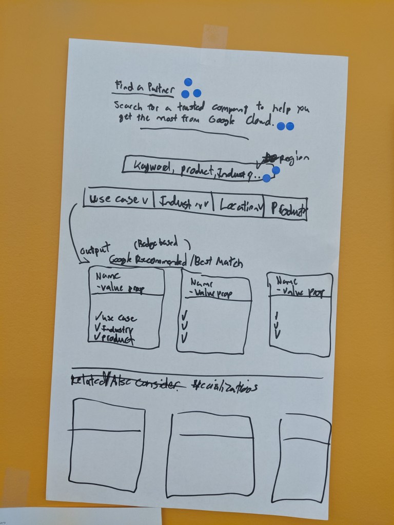
With the ideas that were sketched, presented, and voted upon by the group (including external stakeholders), I was able to move quickly into wireframing, mocking, and prototyping those solutions.
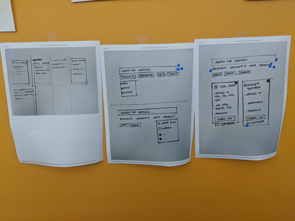
The best laid plans…often are still iterated upon
Despite early alignment, iterations were needed to land on final interaction and layout decisions due to newly discovered design standards, technical constraints, and new business requirements along the way. Roll with the punches!
I made prototypes of each iteration to demonstrate layout and functionality of menus and navigation. The prototypes were presented to the project team and external stakeholders for approval to move forward into the next wave of user tests.
User Testing: Control vs. New Design
I worked closely with the UX researchers to write the screener and test plan for the upcoming user research sessions.
Users were shown the new design, tested on whether they were able to intuitively complete searches, and asked questions on their preference of functionality and interactions. Then, they were shown the original design (“before”) and asked if they preferred either design over the other.
Research Results
Overall, users understood and navigated the new design successfully. Most users preferred the new design over the old one. All in all, the redesign was a success, and research proved that the new design was effective enough to go into implementation (psst…we had already started developing parts of it.)
There were still improvements to make in the copy to help people understand categories and filters, but no major changes to make on the overall design.
