Goal
Update an existing reading app UI & UX to delight children, teens, and adults who are learning the English language.
Platforms
iOS/Android mobile, tablet, web
Software used
Figma, Unity, Miro
Client Stakeholders
Product Manager, Writer/Illustrator, Professor
Project Team
Project Lead, Lead Unity Engineer
Users
Students ages 10-60 with learning disabilities or learning English as a second language
Understanding visual direction
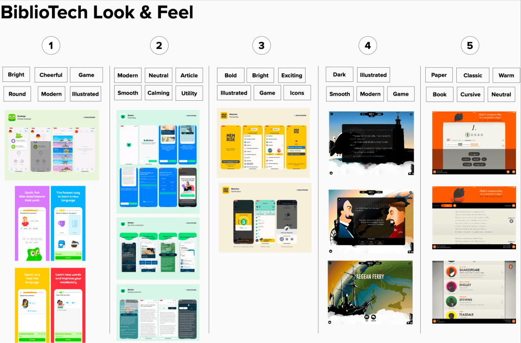
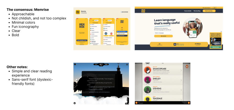
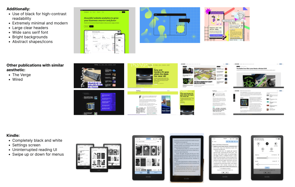
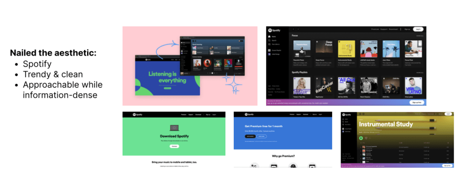
In order to update an app that had been created back in 2015, I needed to gather from the team a consensus on how the new app should look.
Leading the stakeholders through a series of quick workshops to look at comparable apps to determine visual styles, I helped our development team understand the direction for the UI and UX in the app itself.
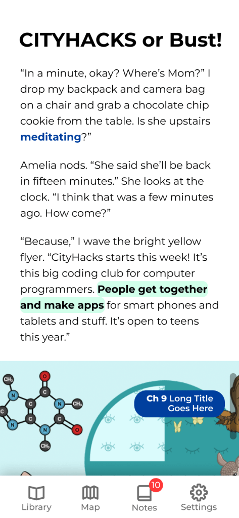
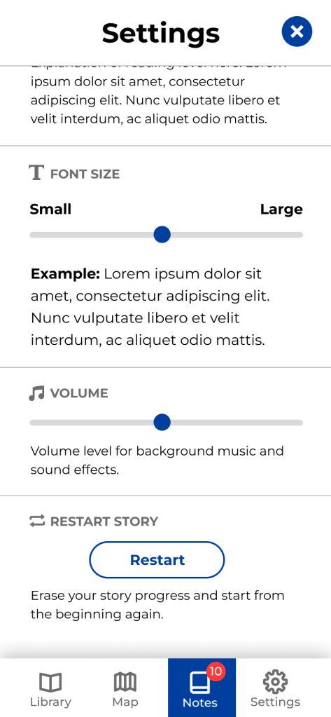
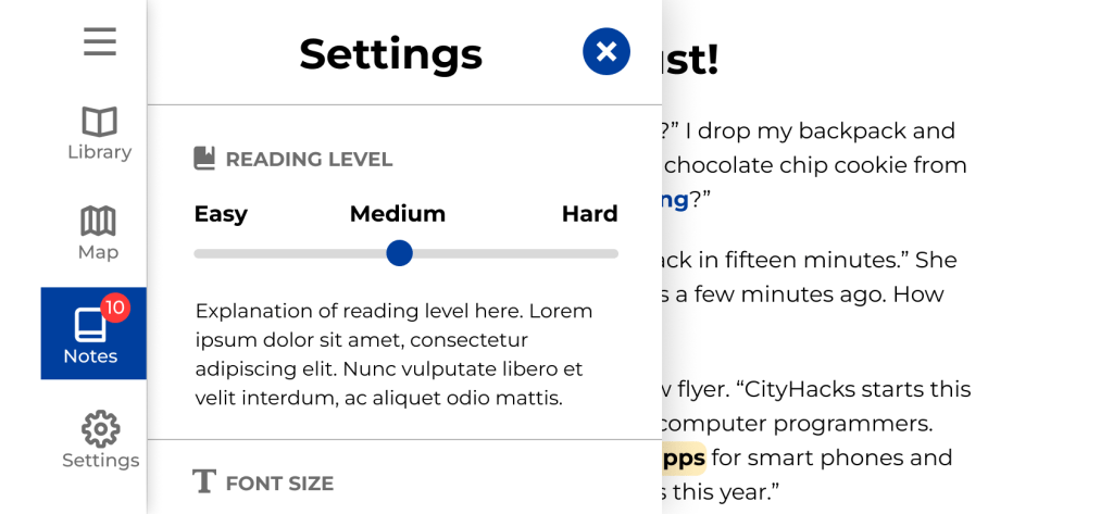
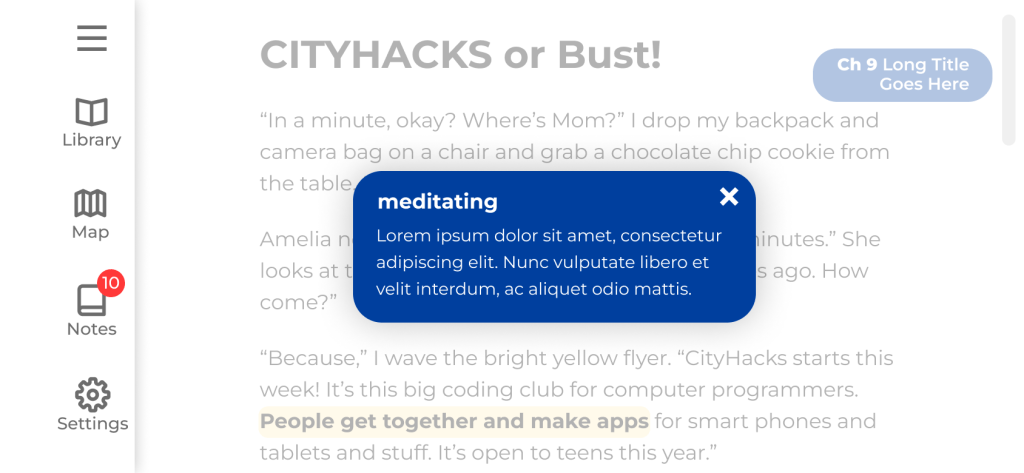
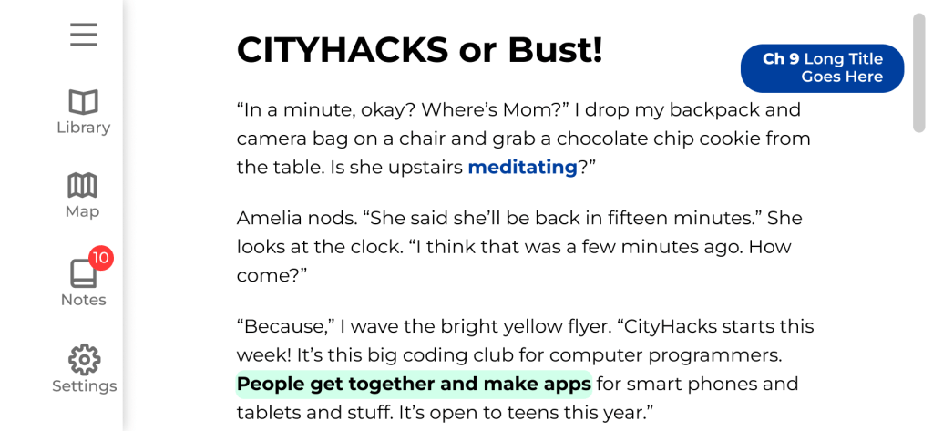
It was essential in this reading app for text to be very legible, and for the colors to have enough contrast for readers who may have visual disabilities. Designing for ADA benefits all users, so we designed the brand and app with accessibility as top in mind.
Later on in the project, I lead a complete branding workshop to rebrand this app completely from head to toe.
Clarifying functionality
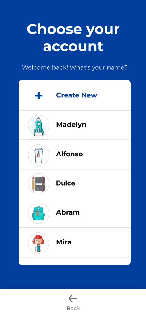
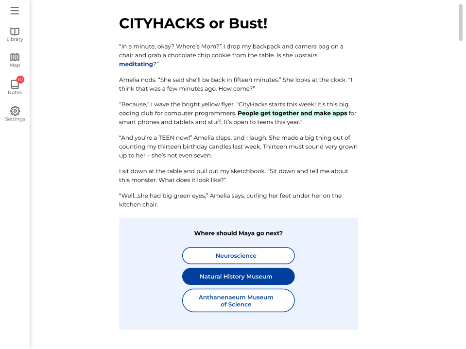
We were given product requirement and content documents. However, to make sure our development team and client team were on the same page, I led weekly meetings to create flow charts and wireframes to clarify the flow, screens, and functionality needed throughout all parts of the app for the first launch.
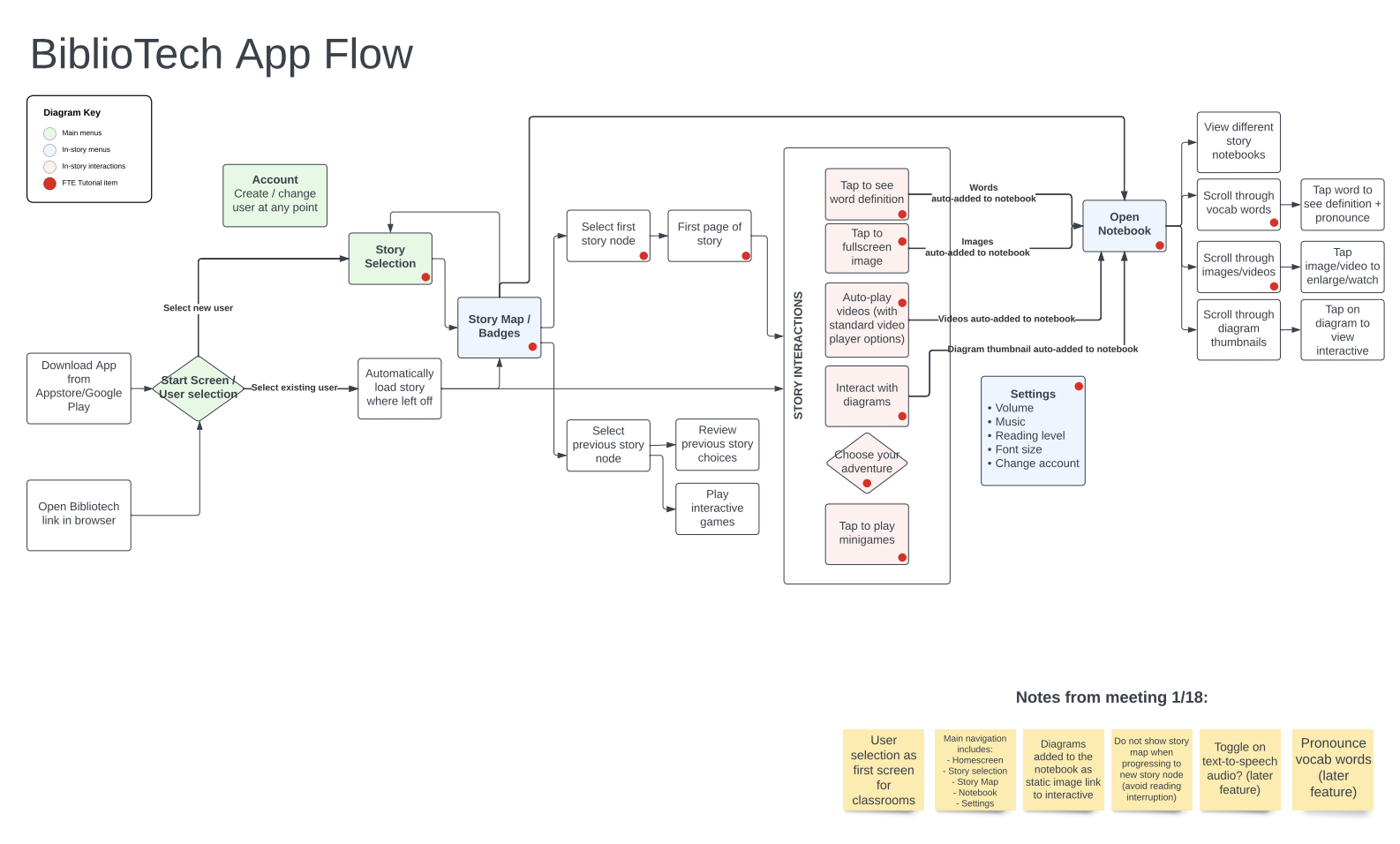
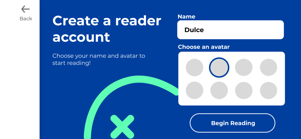
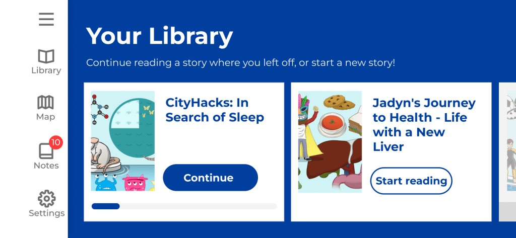
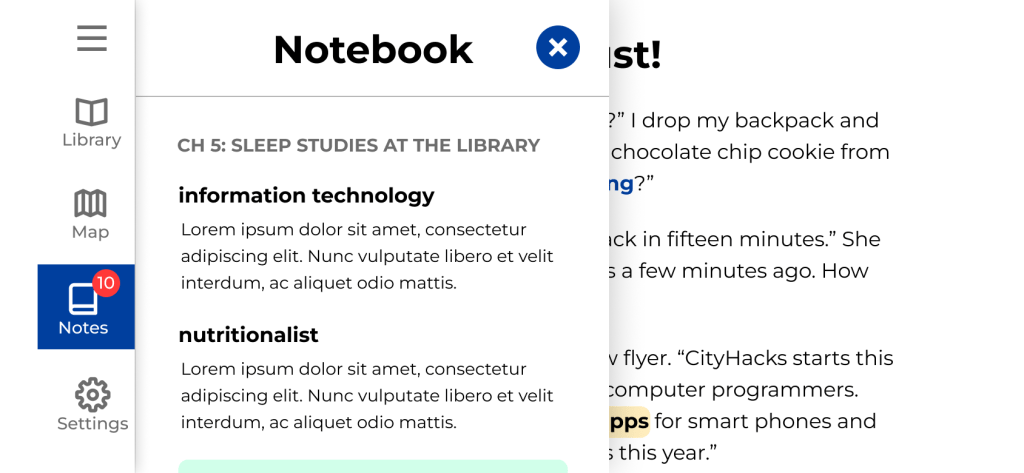
I created wireframes for each of the screens in Figma, and created prototypes to demonstrate the click-through flow of the app. In reviews of each group of features with the stakeholders and development team, we clarified functionality and features within the prototype and app.

Updating the brand
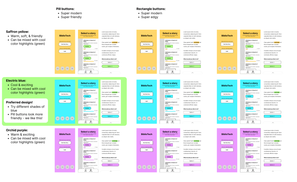
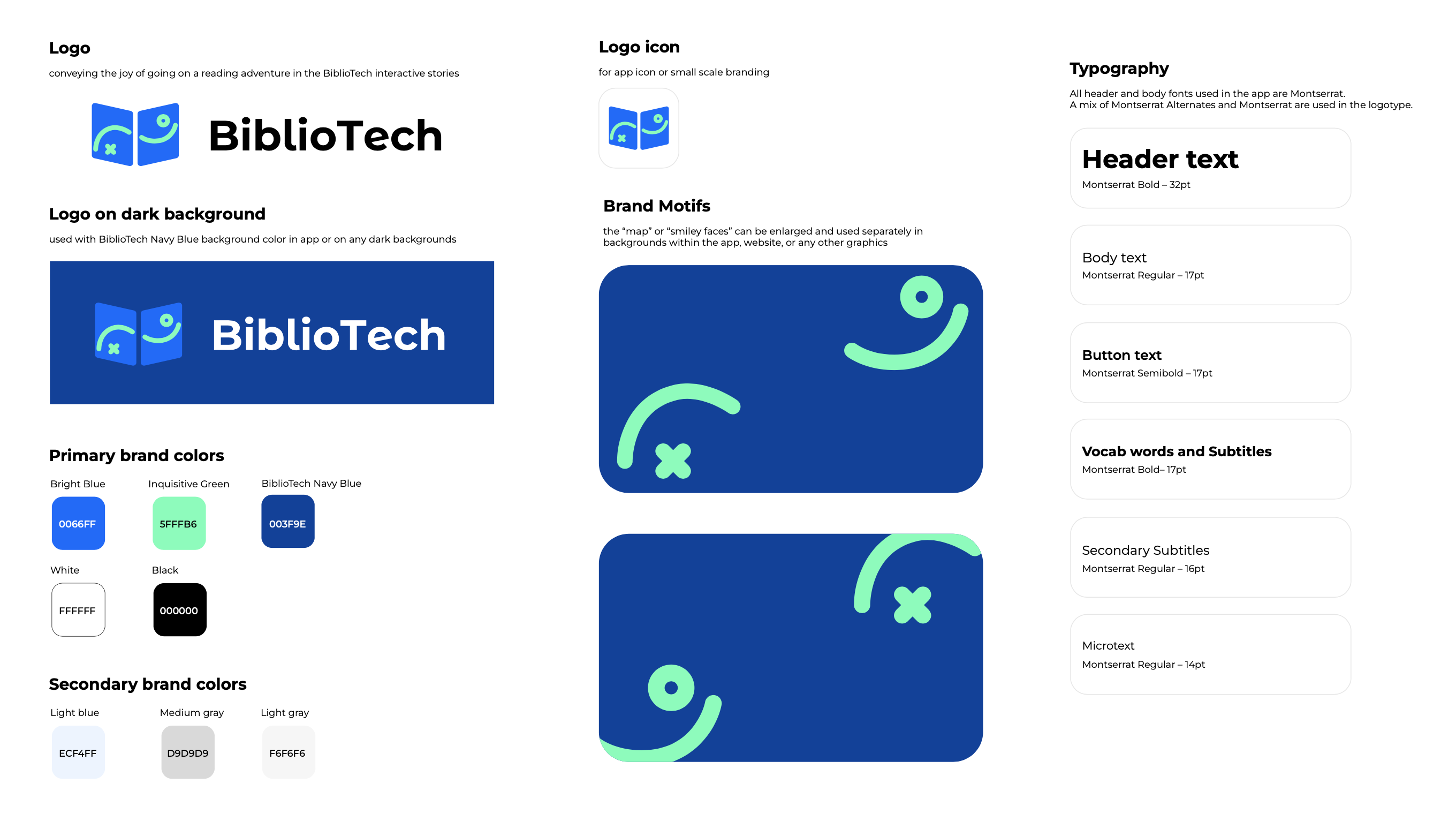
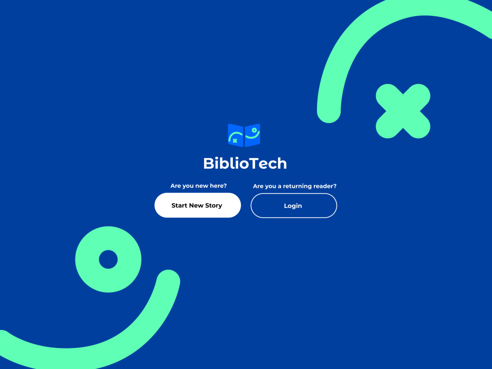
In order to complete the UI for the new version of BiblioTech, I suggested that we nail the brand overall (rather than just the app alone).
We ran a series of branding workshops to find out what logo icon, font, and colors would best represent BiblioTech to our various user segments.
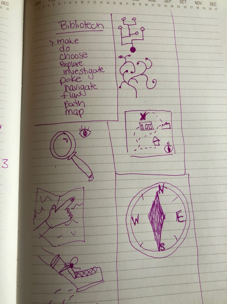
We started with words and symbols that represent how each team member would want users to feel when they use the app.
This generated a few core concepts that showed up commonly across the team brainstorm:
Adventure
Exploration
Choice
Based on these concepts and loose sketches, we had a few contenders for potential logo icons, and discussed amongst the team which was most representative and visually appealing.
Since the usage of the logo would primarily be in app, I also wanted to make sure it was fitting overall for the app design.
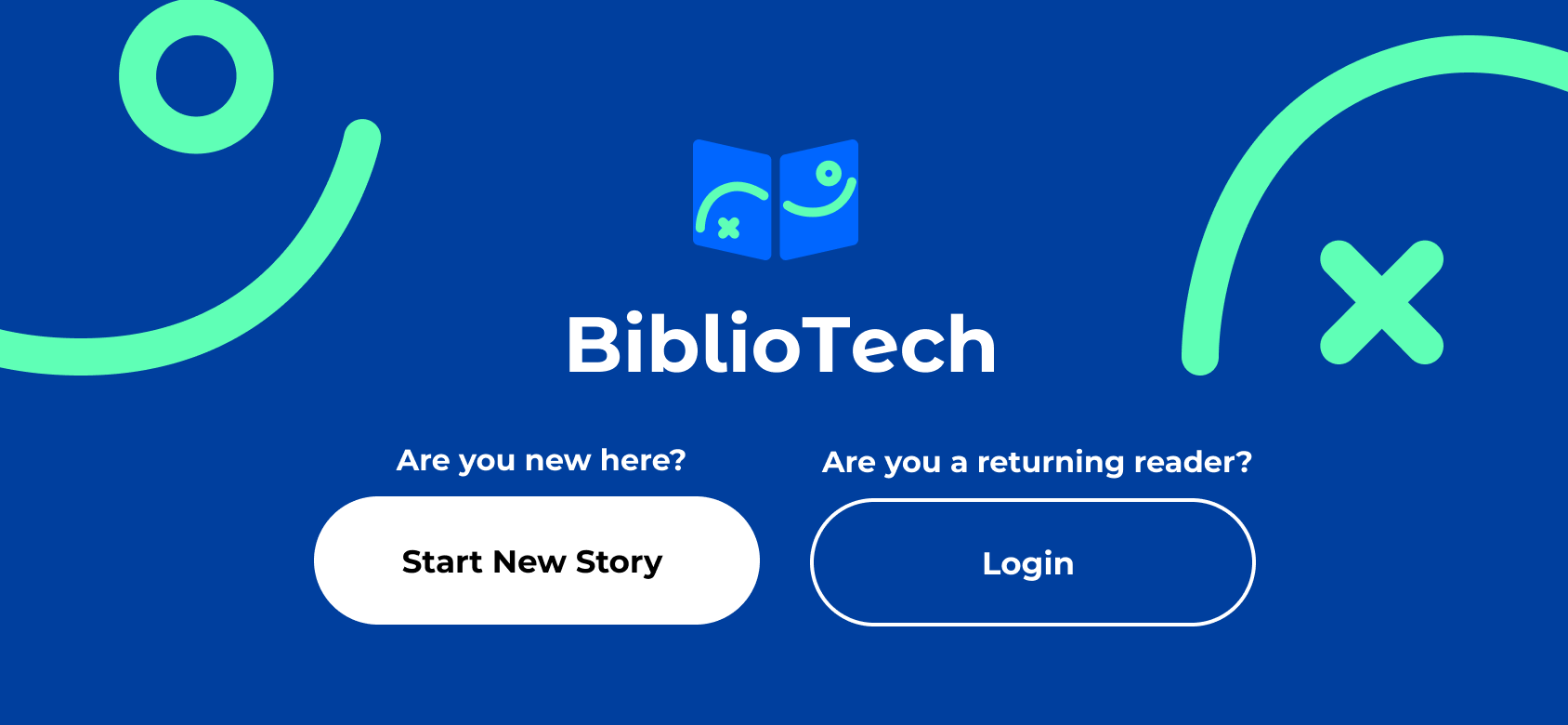
The final design for the brand is very fresh and modern, reminiscent of a book and a treasure map at the same time, with smiley face motifs that feel friendly and approachable for younger users.
I also created brand guidelines so that the company could easily continue using the new brand with any future designs or promotional materials.
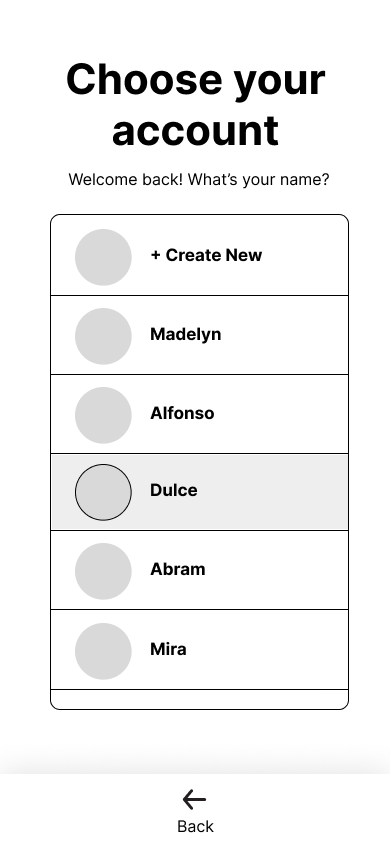
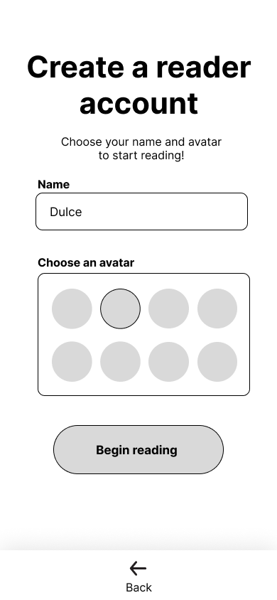
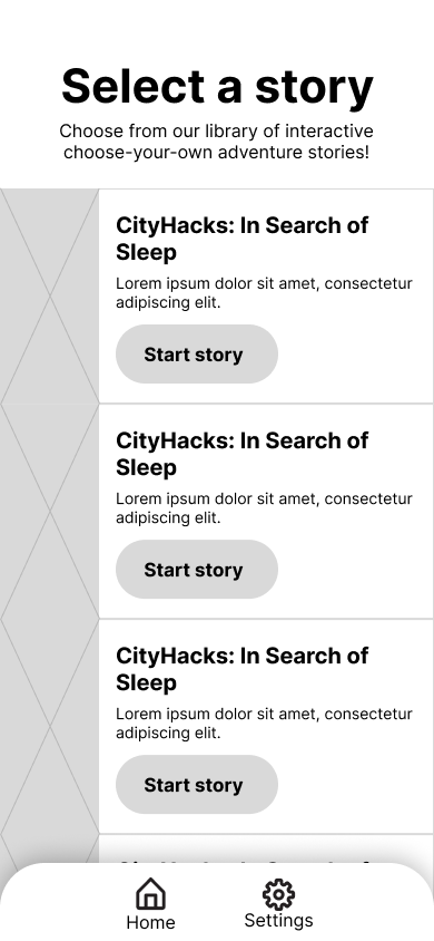
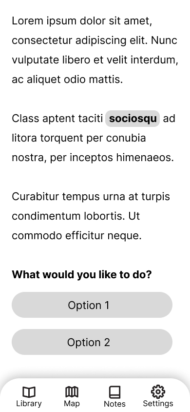
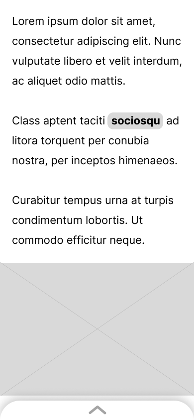
Final design in multiple resolutions
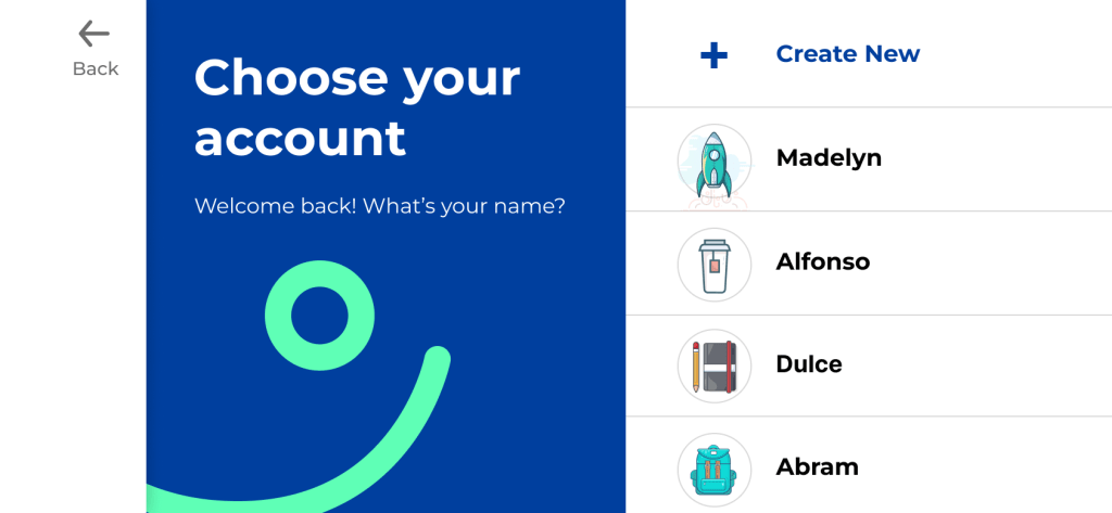
The app will be used natively and in-browser on multiple devices, including mobile phones, tablets, and laptops. I created designs for portrait, landscape, and tablet resolutions to specify for the team how the look and functionality would work.
Phone portrait resolution:


Tablet resolution:
Phone landscape resolution:

The app is currently in development in Unity with the team and will be relaunched in 2024.
