I’ve worked as a solo designer in small startups for much of my career, but December of 2016 I joined Nearpod, a steadily growing edtech company, which included several talented designers in Argentina. As UI/UX Design Lead, I was presented with the task of unifying the design style, assets, and processes across a team of remote designers and team of PM’s and designer (me!) in the US.
Well, challenge accepted.
But where were the problems emerging? Which of the simmering fires needed putting out right away? Within my first week, I started seeing where the flames were burning biggest.
Sharing is Caring
Week 1: A design-oriented PM was creating something in Sketch. I looked over and asked, “Hey, what are you making over there?” He replied, “Oh nothing, just tracing over this logo because we don’t have a vector file for it and Josh needs it pretty soon.” [Insert scream emoji]
Turns out, the designers in Argentina had been keeping all the files to themselves, afraid that sharing with the PM’s would decrease the quality of design. The PM’s, Marketing, and Content team in the US found it too difficult to track down who to contact for files, and simply suffered without them.
The first path to standardization had been laid. We needed to share files. Fast. People were tracing over logos to recreate them…this was an emergency.
- I created a Nearpod Design Team Dropbox folder containing project files, logos, and resources that the entire product team uses to deliver, collaborate, and share files. Now PM’s will know exactly where to find that Sketch file for that project from May of last year. And also where to go to find the Style Guide to check for consistency on their projects (more on that later). Designers will do everyone a favor by saving their final files into this shared folder.

- I also made a simple shared Google Drive folder that contains some nicely exported versions of the Nearpod logos and Brand Style Guide, for easy access by anyone internal and external to the company.
In the future…
There are some exciting emerging design versioning software that give me hope that designers can collaborate on files the same robust way that developers do. For now, they’re still in beta, and we’re managing alright with our small team of designers and Dropbox (only one “Oops, the new designer deleted all the files” scare so far – thank goodness for Dropbox versioning!). But I’m keeping my eyes out for better ways to share and collaborate.
Style Matters
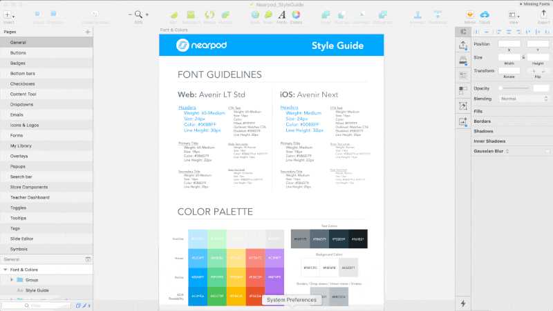
Before I joined, there was a previous designer who had created a basic Style Guide. It only included fonts and colors. Then, one of the PM’s also started expanding on this to include some screens, icons, and components from Nearpod. It was progress, but it was not comprehensive enough to be able to use for design quite yet.
What we needed was a full Component Library, where individual elements within layouts are available for reference and use, and use cases for them are defined.
So in the next months as I worked on my own projects and seeing other projects going on at Nearpod, I made it my side project to always update this Style Guide & Component Library Sketch file with newly encountered elements, and establish rules for using certain styles or elements.
The Style Guide grew from a 1 page Sketch file, to 20 categorized pages filled with delicious design elements.
It was easy to gradually collect elements to add to this behemoth library over a few months, and before we knew it we had a library that was regularly used by designers and PM’s to check the consistency of their projects against the “Nearpod Style”.
What’s next?
Ideally, the Sketch file of components should match up exactly with our developers’ React library of components in the actual product. Neither libraries are fully flushed out yet, but we are both chipping away at it from both ends of the problem, and will hopefully meet in the middle with a design library that completely matches the actual product.
The Motion Movement
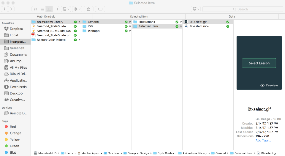
As design and code has gotten more and more sophisticated in the recent years at Nearpod, the designers and developers have been excited to add flourishes of animation to the product. At first, this seemed like a “Sweet! We’ll just make them as one-off’s since they’re new!” kind of deal.
But recently, I got an email from a PM to approve a loading animation that an external team had made. Wait, we already have like 4 existing loading animations, don’t we?
Hold up. We need an Animations Library.
Luckily, with our shared Dropbox folder already equipped with most of our design files, this was an easy solution. I simply gathered .gifs and .mov’s of animations and placed them into an Animations Library folder, organized by device (Web/iPhone/iPad) and project.
Sent a Slack message out to the Product Team to notify them to check the Animation Library if they have any animation needs, before creating any new ones. And voila!
Definitions make for Happy Designers
This one was a biggie. We hired a couple of new designers in Buenos Aires, who at first felt properly supported with all of our design resources already. I beamed with pride as the fledglings took flight on their first couple of projects.
But well into one designer’s second project, the design process came to a halt as the designer was told to wait for project definition. I could sense the designer’s discomfort with having started with ambiguous requirements for the project, and he later admitted that he wished there was better documentation in the beginning so that he didn’t have to spend so much time taking stabs at the design in the dark.
I started realizing that some of my own projects had encountered some pretty big bumps in the road – bumps that could have been avoided if we had carefully thought out the requirements at the beginning of the project.
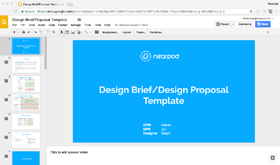
To avoid future project potholes, I created a Design Brief template for PM’s to fill out before assigning a project to a designer. It includes some neat tables for:
- Participants: PM’s, Designers, and Developers involved in decision making on the project
- User Story: A one-sentence user story told from the perspective of the user(s) affected by this feature
- Types of Nearpod users affected: Teachers of various tiers, Students, Admins
- Devices: Does the feature need to be implemented for…Desktop for Teachers, Desktop for Students, iPhone native app, iPhone browser, iPad native app, iPad browser? With a widely cross-platform application like Nearpod, devices were both confusing and easily missed if not defined early on.
- Nearpod Features affected: Nearpod is a complex product with different areas of the product requiring design, so it was important to spell this out before designing to make sure every part of Nearpod that the feature could touch is accounted for. This list gets long sometimes.
- Scope: v1 and v2 features are defined. What is included and not included for this version is defined.
- Timeline: And lastly, an estimated release date so that the designer knows if he needs to book it to finish this project, or if he can focus on other projects before completing this one.
These processes are far from perfect, and are definitely still a work in progress. But we have taken some long strides from when I first started last December, and even though the processes aren’t perfect, they have definitely helped the team work together more efficiently than before.
Have more questions about my work? Feel free to reach out!
 STEPHANIE PAN